
Getting the message out
Just yesterday I received a new cover design for my next book. I’ve been holding it up to the light, puzzling about whether I like it and seeking out opinions. Is the blue too blue or the white too white? Should the text be serif or sans serif, and what about the size of the words? All will be reavealed about the details, hopefully very soon.
In the meantime I continue to find myself attracted to the kind of advertising which breaks the mould and gets the message out. (You can find more examples here) One great example of this is the bench sponsored by Superette clothing in New Zealand, which imprints its message on the legs of those who use it:

Image: designer-daily
More poignant still is this offering from Amnesty International:
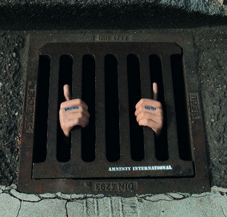
Image: designer-daily
Whoever would have thought a drain could ‘speak ‘ with such eloquence?
Looking at the image above certainly puts my cover concerns and font conundrums into the right kind of perspective!